Reading the Exhibition Room
When visitors step into a photography exhibition, the first judgment is almost always unconscious: how fast should I walk, and how close am I invited to stand? Before a single wall label is read, the curatorial design of the room has already established a grammar of attention. At Buzzgallerybulletinre, our coverage begins not with a promotional summary of an artist's biography, but with a forensic reading of the room itself.
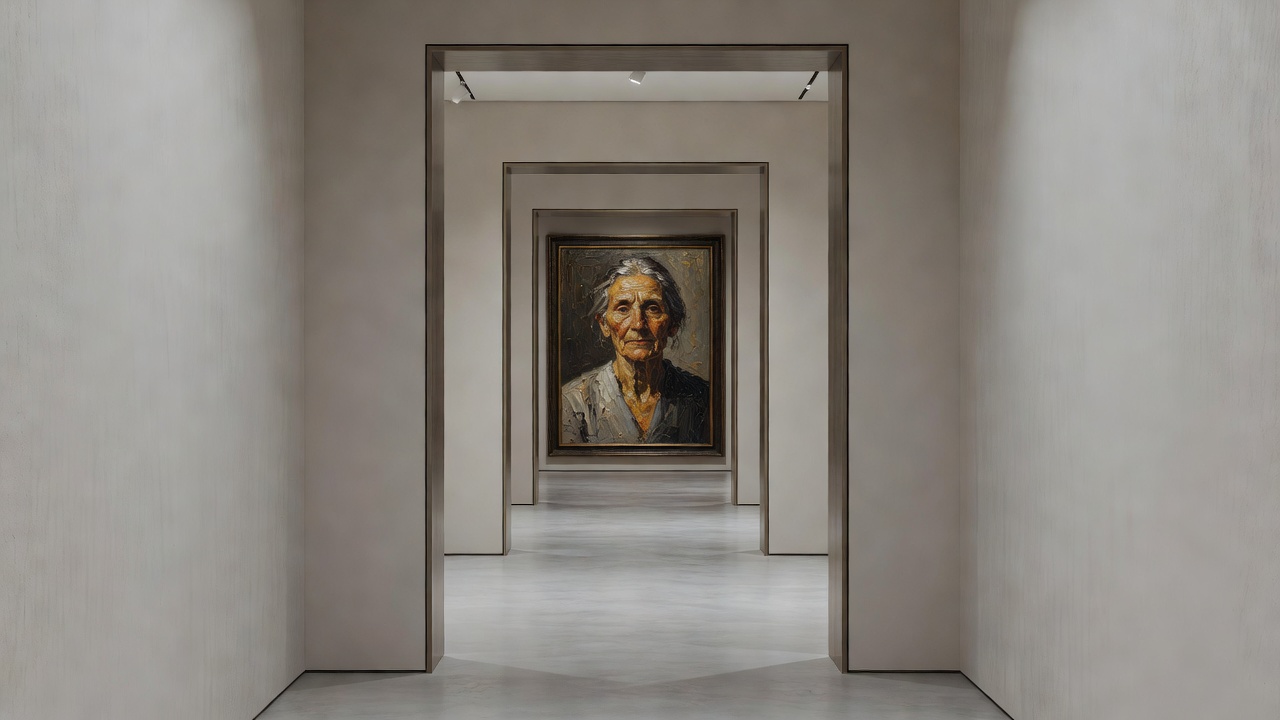
1. Sightlines, Pacing, and the 57-Inch Myth
Reported Fact: Standard museum installation manuals in North America and Europe have historically cited 57 to 60 inches (roughly 145 to 152 centimeters) from the floor to the center of the artwork as the default eye-level hang, derived from mid-twentieth-century commercial gallery conventions popularized in New York and London.
Editorial Interpretation: While a uniform centerline creates calm horizontal rhythm for mid-sized silver gelatin prints (such as 11x14 or 16x20 inches), strict adherence to it can flatten the emotional cadence of a complex body of work. In landmark historical shows—ranging from Edward Steichen's 1955 The Family of Man at the Museum of Modern Art (designed with architect Paul Rudolph) to Wolfgang Tillmans' 2017 Tate Modern survey—varying the vertical height forces the viewer's body out of passive scanning.
When a print is hung noticeably low, near waist height, it echoes the intimacy of looking down into a camera's waist-level viewfinder or reading a book on a desk. Conversely, when an architectural study is mounted slightly above eye level, the viewer's neck tilts upward, mimicking the physical sensation of standing before the facade itself.
2. Surface Materiality: Glazing, Paper Base, and Scale
A photograph reproduced on a phone screen has uniform luminescence; a photograph on a gallery wall is an object made of rag fibers, baryta coating, silver halides, or pigment droplets. During the late 1990s and 2000s, following the rise of the Düsseldorf School (associated with Bernd and Hilla Becher's students at the Kunstakademie Düsseldorf, including Andreas Gursky, Candida Höfer, Thomas Struth, and Thomas Ruff), monumental chromogenic prints face-mounted to Perspex or acrylic (the Diasec process) became the dominant visual signifier of contemporary museum photography.
"To glaze a print with anti-reflective museum glass or to mount it raw on aluminum is never merely a conservation decision; it determines whether the viewer sees the room reflected inside the image's deepest shadows."
In current gallery programming across London, Paris, Berlin, and New York, curators are staging a deliberate counterpoint to high-gloss monumentality. We are seeing a marked resurgence of:
- Unframed Cotton Rag & Mulberry Papers: Pinned directly with entomology pins or rare-earth magnets, allowing the paper's deckled edge to curl subtly in response to the room's humidity.
- Contact-Size Platinum/Palladium Prints: Requiring viewers to step within ten inches of the wall, effectively preventing more than one person from viewing the work simultaneously.
- Matte Baryta Inkjet and Warm-Tone Fiber Prints: Chosen for their ability to hold velvety D-max blacks without acting as a mirror under track lighting.
3. Sequencing as Montage: Diptychs, Clusters, and Blank Wall
Photography is uniquely relational. As Nathan Lyons demonstrated in his influential workshops and exhibitions at the Visual Studies Workshop in Rochester, placing two unrelated photographs three inches apart immediately generates a third, synthetic meaning in the viewer's mind. When reading an exhibition room, pay close attention to the width of the intervals between frames.
A wide expanse of blank, painted drywall after a dense sequence acts as a paragraph break—giving the eye a neutral field to clear afterimages before entering a new thematic chapter. When curators paint a specific alcove dark charcoal or deep moss green, they lower the ambient reflectance around the print edges, making the highlights within the photographs appear self-illuminated without increasing the actual lux output of the ceiling fixtures.
| Presentation Method | Visual & Spatial Effect | Conservation / Viewing Trade-off |
|---|---|---|
| Window Mat + Museum Anti-Reflective Glass | Classic archival boundary; isolates image from wall color; zero surface glare | Creates slight physical recession from the viewer; high framing cost |
| Diasec / Face-Mounted Acrylic | Hyper-saturated depth; eliminates paper texture; monumental objecthood | High specular reflection; scratches cannot be easily repaired |
| Direct Magnetic or Pin Mount (Unframed) | Immediate tactile intimacy; emphasizes paper weight and curl | Vulnerable to air currents and dust; requires strict barrier distance |
| Transmissive LED Lightbox | Cinematic glow; thrives in darkened rooms; commands long sightlines | Overpowers adjacent reflective prints if placed in the same sightline |